Interactive impact mapping of Covid-19
The ATI has mapped the impact of Covid-19 on the aerospace and aviation sectors.
The aerospace and aviation sectors are feeling the brunt of the pandemic’s impact due to significant flight restrictions, aircraft parked up on ground around the globe and uncertainty of the future market demand. We have developed an interactive dashboard which maps the impact of Covid-19 on the aerospace and aviation sectors.
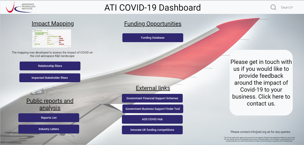
The ATI Covid-19 dashboard <link> contains sections on impact mapping, publicly available reports and analysis, a database of funding opportunities associated with Covid-19 and external links to support for businesses. It is intended to be used as a resource to help comprehend and track the magnitude of the impact.
Impact mapping
Considerable research was done into the state of the industry by tracking media coverage, webinars and published insights. These have been mapped to produce item points (as shown in Figure 1) that represent key impacts on the sector. The mapping includes stakeholders ranging from airlines to the supply chain. This is key to understanding how wide-reaching the impact has been and provides a holistic view across the aviation and aerospace sectors.
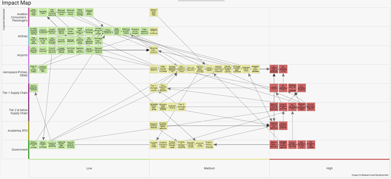
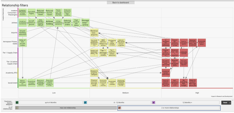
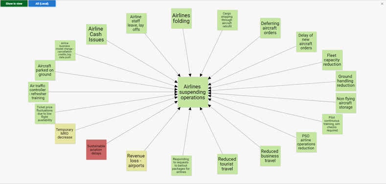
Over 90 items have been captured so far, and more are being added. Relationships were created to link items and create a path, defining how items relate to one another. As the pandemic has progressed, additional data has reinforced the relationships between certain areas, and this is key in understanding the ripple effects that are being created. The dashboard view in Figure 2 filters the impact mapping to show items that have two or more links (relationship arrows) to others, and therefore experiencing a greater degree of the Covid-19 impact.
Visualising the impact on R&D was a key focus of this project and the relationships help to show where the impacts are originating. This view is especially powerful as it demonstrates links to relevant stakeholders.
How to use the ATI Covid-19 dashboard
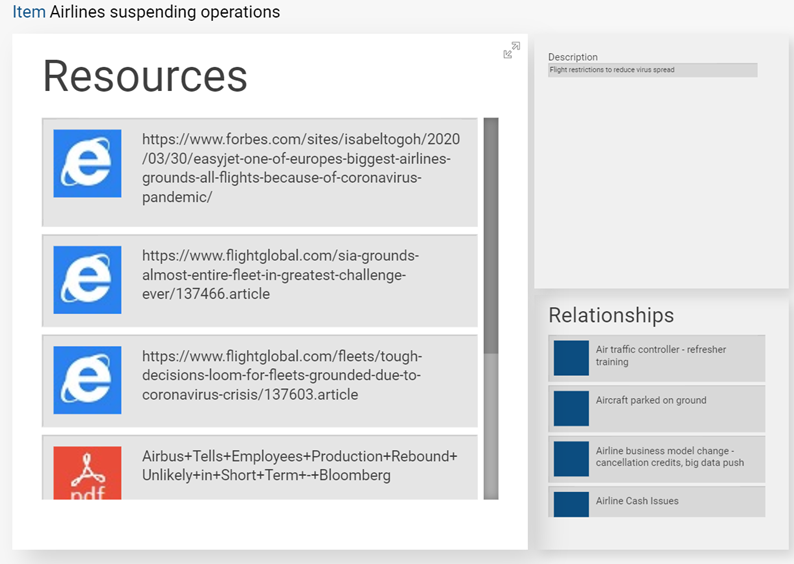
Items are interactive – clicking on a tile on the map will show items linked to it. This additional context helps to develop understanding of some of the causes and repercussions related to that specific item. Items are also linked to the impacted stakeholder and R&D impact level, as per the example below.
Clicking on a single tile reveals its relationships to other items:
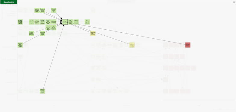
Clicking the item again produces a focused view of the related items:
By clicking again on the item, the detailed view will appear which contains links to resources:
The interactivity of the map means views can be tailored to see different impacts on stakeholders from airlines to academia. The mapping allows insights to be gained from macro and micro levels. For example, it is possible to see how significantly reduced flights have affected the demand across the manufacturing supply chain and more specific challenges within.
The mapping and data resources are publicly available on the ATI Covid-19 dashboard, which has been made fully interactive via SharpCloud.
We invite you to explore the dashboard, and if you would like to submit any other publicly available data, please do so via the contact box on the dashboard.
Note: The ATI developed the impact mapping to assess the impact of Covid-19 on the civil aerospace R&D landscape. In doing this, the ATI has used public reports and sources. These do not necessarily reflect the views of the ATI, and neither can the ATI guarantee the accuracy of the information. The ATI takes no responsibility for any business decisions or other actions taken as a result of the information contained within the dashboard.